
Writing Research proposal : conclusions / results
Writing conclusions
The main purpose of the conclusion is to show that the main purpose of the piece of writing has been achieved.
- It should recall the issues raised in the introduction - what was the purpose of the piece of writing?
↓ - and draw together the points made in the main body of the piece of writing
↓ - and come to a clear conclusion.
Presenting Results
The results section of the report clearly describes the findings of the study. It is usually presented both in diagrams and text.
Research Report Results
The results section of the report clearly describes the findings of the study. It is usually presented both in diagrams and text. The elements included in the method section text and the order in which they are presented may differ from department to department. However, the list in the following box is typical and provides you with a good model. You might need to repeat this several times if you have different diagrams and charts.Make sure, though, that you do not start to interpret the results. This will take place in the dicussion section, which comes next.
ELEMENTS INCLUDED IN RESULTS SECTION
- introduction to the results
↓ - statement showing where the results can be found
↓ - statement presenting the most important findings
↓ - statement commenting on the results this may include:
- summary of the results
- re-organisation of the results to show trends and tendencies
- conclusion from the results
Diagrams
|
↓ |
|
↓ |
|
|
↓ |
|
↓ |
|
↓ |
|
When the information has been collected, it is usually analysed using various statistical techniques. It is then presented in tables, graphs or charts.
1 Tables
Country of Origin of Students on Foundation Course
Female Male China 30 40 Japan 2 8 India 1 7 Pakistan 1 4 Thailand 3 1 Malaysia 2 1
| Female | Male | |
|---|---|---|
| China | 30 | 40 |
| Japan | 2 | 8 |
| India | 1 | 7 |
| Pakistan | 1 | 4 |
| Thailand | 3 | 1 |
| Malaysia | 2 | 1 |
Tables:
- are efficient, enabling the researcher to present a large amount of data in a small space
- show exact numerical values
- present quantitative data - they need interpreting
- they emphasise the discrete rather than the continuous.
- the number of students on the course
- the percentage of female students
- the percentage of female students from China
- relationships or trends.
2 Pie charts
Pie charts can be used to show the sizes of various parts of the results in relation to each other and in relation to the whole sample.
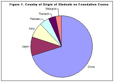
In the pie chart above:
- the circle represents the total number of students on the course
- each segment represents the number of students from one country. It shows that there are students from 6 countries
- it clearly shows the largest number of students come from China
- it also shows that about 10% of the students come from Japan
- it shows that fewer students are from Malaysia than India
- it shows that a similar number of students come from India and Japan.
- it does not show how many students there are altogether.
- it does not show how many students there are from a particular country.
- it does not show small differences between countries.
3 Histograms
Histograms (or bar or column graphs) can also be also used to describe results. However, they more clearly show the relationship of different parts of the sample to each other. They do not clearly show the parts in relation to the whole.

Look at the histogram above. This clearly shows:
- the proportion of male to female students
- which country has the most students
- which country has the fewest women
- the number of students from India.
- the number of students on the course.
- the percentage of female students.
- the percentage of female students from China.
4 Line graphs
Graphs are often used to show the results of studies, especially when they involve some kind of change over time. This usually involves two groups of measurements which are known as variables.
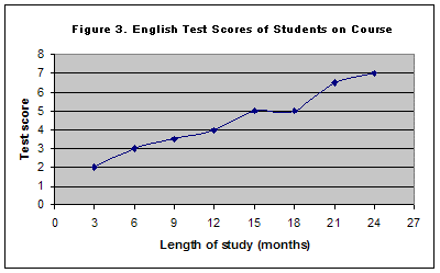
The graph above shows the differences in the English test score of the students on the course.
- The two variables are the length of time the students have studied English and the students' test scores.
- The length of study causes the change. (This is called the independent variable and the other - the test score - the dependent variable.)
- The length of study is on the horizontal (x) axis.
- The test score is on the vertical (y) axis
- trends & tendencies - you can see that the test score generally increases as the length of study increases.
- that a typical student who has studied for 12 months has a score of 4 on the test.
- that a typical student who has scored 6 on the test will have studied for 18 months.
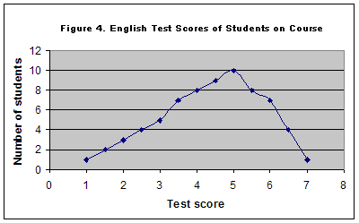
- The independent variable is now the test score.
- The dependent variable is the number of students who obtained a particular score.
- The highest score is 7 the lowest score is 1.
- The most common score is 5
- 8 students achieved a score of 4.
5 The Average
The average is a measure of central tendency. It is related to the middle point in a range of scores and is found in many different kinds of research. It can be calculated in three main ways. Most commonly, it refers to what mathematicians call the mean. This is calculated by adding all the scores together and then dividing by the number of scores. For example, if five students obtain the following test scores: 2.5, 3, 3, 4 & 5, then the average test score (the mean) is 17.5 (the total) divided by 5 (number of students) = 3.5. You can see in this case, though, that none of the students actually obtained a score of 3.5.
Sometimes it is not useful to calculate the average in this way. For example, we may want to see which score on the test was most frequently obtained. This kind of average, referring to the most frequent score, is called the mode, and is also a very useful average. In this case the mode is 5. 10 students obtained a score of 3.
The third useful average is the median - this is the middle score obtained by the students on the test. In this case the median is 3.
6 Dispersion
Dispersion is the spread of scores. Whereas the various averages will give us information about central tendency, it does not give very much information about the group as a whole. We need to know more about a set of scores than the mean can tell us.
One useful piece of information is the range from the bottom to the top score. In the example above when five students obtain the following test scores: 2.5, 3, 3, 4 & 5, the range is the difference between the bottom score and the top score, inclusive of both scores, i.e. 3.5.
It is common to plot the range of scores on a graph. This can show easily the range of scores (from the lowest to the highest) as well as the number of students who obtained each score. For example, if the scores of 69 students are plotted on a graph, it would look something like the diagram below.
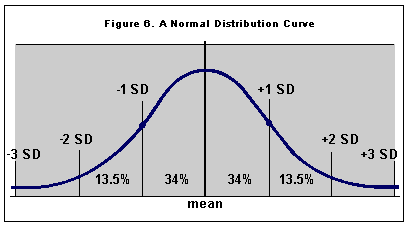
If the sample of sixty-nine students was representative of the students at the university as a whole, then the most common score of university students would be 50%, and the majority of students would have scores around 50%, with a few students at either extreme. See the diagram below. Idealised curves such as the one shown below are called normal distribution curves. The number of people on one side of the centre is the same as on the other side, with about 50% of the students near the centre.
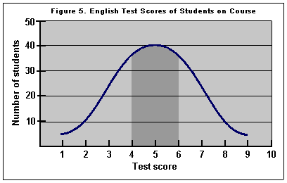
One common measure of how much the scores are spread is the standard deviation (SD). This shows how much the range of scores deviate from the mean. In a normal distribution 68% of the population will get scores within one standard deviation of the mean and so 32% of the population will have scores more than one standard deviation away from the mean. 95% of the population will have scores within two standard deviations of the mean.
Analysis
Read the following example of part of a results section from the field of computer assisted language learning and teaching. The study investigated the use of the World-Wide-Web for teaching writing in a British university. Identify the information elements you find in each sentence of the selection. (NOTE: Some sentences may contain more than one element.)
Use Of A Writing Web-Site By Pre-Masters Students On An English for Academic Purposes Course.A. J. Gillett, University of HertfordshireResults1Two groups of Students in Higher Education - Group A and Group B - on a one-year Pre-Masters English for Academic Purposes course, each comprising 50 students were taught academic writing by different methods and compared. 2Figure 3 displays the mean percentile scores on the five subsections of the academic writing test. 3Students in Group B, which used the computer assisted facilities, performed considerably better than their non computer-assisted peers on all five subsections of the test by more than two to one in terms of scores attained in each of the subcategories. 4For example, in the task achievement subcategory, Group A scored an average of 80 percent, while Group B students scored an average of 14 percent.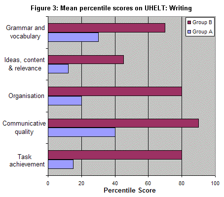
Use Of A Writing Web-Site By Pre-Masters Students On An English for Academic Purposes Course.
A. J. Gillett, University of Hertfordshire
Results
1Two groups of Students in Higher Education - Group A and Group B - on a one-year Pre-Masters English for Academic Purposes course, each comprising 50 students were taught academic writing by different methods and compared. 2Figure 3 displays the mean percentile scores on the five subsections of the academic writing test. 3Students in Group B, which used the computer assisted facilities, performed considerably better than their non computer-assisted peers on all five subsections of the test by more than two to one in terms of scores attained in each of the subcategories. 4For example, in the task achievement subcategory, Group A scored an average of 80 percent, while Group B students scored an average of 14 percent.
No comments:
Post a Comment